
https://www.nrk.no/osloogviken/xl/tiktok-doesn_t-show-the-war-in-ukraine-to-russian-users-1.15921522
In this article, by the Norwegian public service broadcasting company (NRK), they investigated how TikTok’s so called “For You Page” differed between two neighbouring Ukrainian and Russian cities. This article is a good example of data journalism, as the main source of data was gathered in the same way that people normally consume said media content.
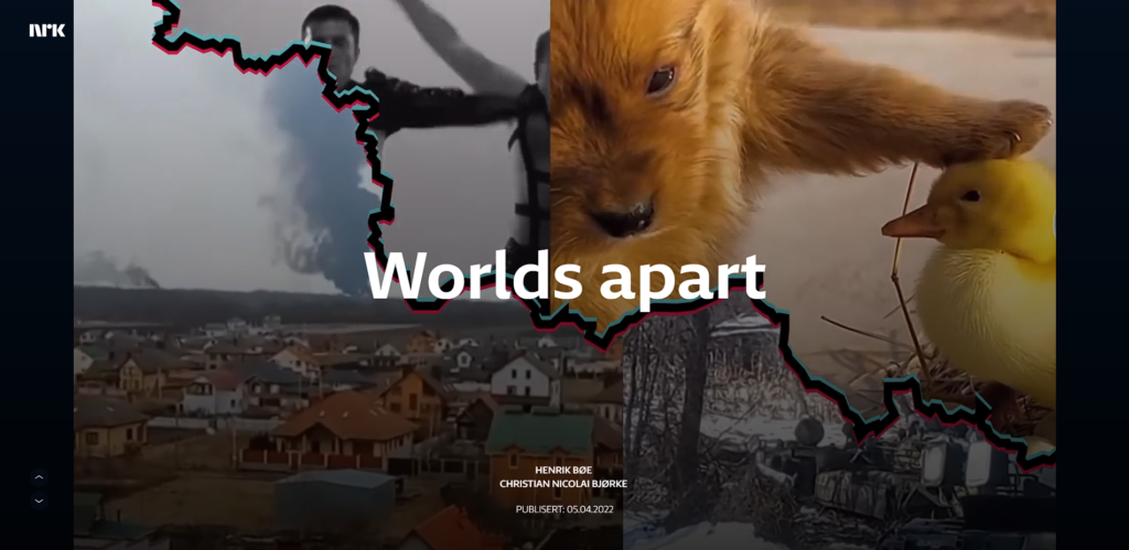
They created two identical bots that had the task of scrolling TikTok. One bot was given Ukrainian nationality and a Ukrainian IP-address and the other one was given Russian ones respectively. They then recorded the tiktoks that were scrolled and viewed by the bots and used this seemingly organically gathered data to investigate what a Ukrainian and Russian person respectively likely would see on their feed in regards to the war. They found that the Russian account saw 1 video about war out of 400 videos, while the Ukrainian one received a heavy amount of them.
This also fits the description of datajournalism as the data gathered has a central role in the visualisation of the article.
Comment:
I do still find the article to be relevant but the reasons for it have changed ever so slightly. What I find clever about the article now is that the journalists have made gathering data yourself very efficient. More specifically, because they use a method known as the “method of difference”. This method can be used when one wants to find out the effect one variable has on the outcome by keeping all other variables the same (Teorell and Svensson 2016, p. 226). In this case the bots that have been coded with the exact same variables, but the only difference being the IP address through which they operate. Any results they find can therefore be attributed to the Ukrainian IP address. The data gathering process was in other words an efficient method of scraping data. The angle used can be described as investigating variation in two areas. According to Bradshaw (2020) stories where one expects similar treatment work best with this angle. Before reading the article one could imagine that since Kharkov and Belgorod are geographically close to each other, the content shown on TikTok in regards to the war would be similar. This is quickly proven wrong and provides a good angle for the article. The authors of the article also visualise the data using the well known interaction that TikTok has come to be known for; scrolling. Seyser & Zeiller (2018, p. 402) describe how the New York Times were pioneers in using scrollytelling as a multimedial format of visualising data. However the authors of this article have taken the format and applied it in a way that is undeniably linked to the data itself, giving it a whole other purpose in terms of visualisation. The article does not offer the reader much interactivity however. Appelgren (2018) describes this is journalistic paternalism. Since many thousands of TikTok videos had been gathered and analysed, I believe it would serve the article well if they let the reader browse through the TikToks that they analysed. This would grant the artivcle more transparency. As it currently stands the reader is presented with examples of TikTok videos from both areas, but they are unable to go through the differences themselves, which I believe would reduce the level of paternalism. I would however not argue that this alone makes it a bad example of how to conduct data journalism.