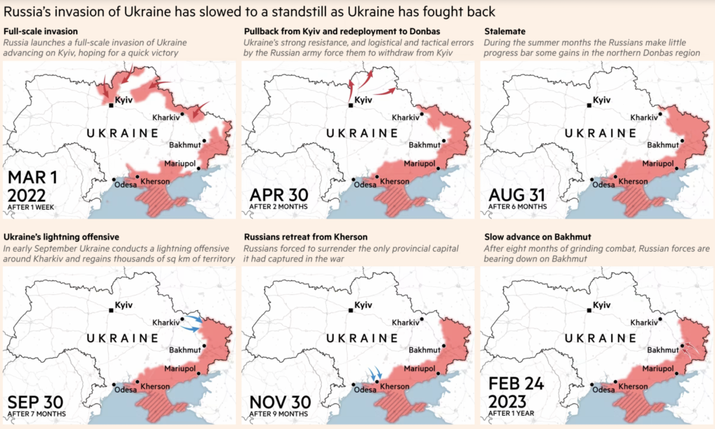
My recommendation is this Financial Times piece on the war in Ukraine. Through a series of 10 different maps, data visualisations and atlases, a ‘Visual Guide to the War in Ukraine’ has been compiled – particularly useful for those who are unfamiliar with the region but want to visually track what they may have read or heard from other media sources. The guide is regularly updated to provide the latest relevant information as well as the historical context of the ongoing conflict.


Firstly, this data journalism piece focuses on the Russia-Ukraine war, using data to showcase the latest developments in Ukraine’s counteroffensive against Russia.
One of the key questions in the use of data for journalistic purposes is whether it extends the time horizon of reporting, shifting the focus from chronicling the daily or even hourly event in a de-contextualized fashion versus looking at longer trends over time, embedded in a variety of thickly nuanced places and times (Anderson, 2015).
Today, this data journalism piece continues to be updated in real-time, spanning a significant period. It has gathered a substantial amount of data, encompassing the latest progress of the war, data on missile and drone attacks, Russian defensive structures, and refugee data resulting from the war, among other things. What particularly struck me in this article is its extensive use of colorful visualizations, and the close connection between visualization and journalistic value is highlighted (Coddington,2015). This article uses clear visualizations to present the news narrative.
It employs Mapbox to illustrate the entire process of Ukraine’s counterattack against Russia using both regular and satellite maps, annotating various details with different colors and shapes to make them easily understandable. Additionally, It uses satellite map visualizations to depict the devastation that the war has brought to cities, allowing people to vividly experience the cruelty of war. The article also includes statistics on refugee-related data, further prompting individuals to disdain war.
Where the journalistic value added lies not in unmasking a hidden truth but in putting the overwhelming torrent of information into patterned context (Anderson, 2015).We may not uncover the truth behind the Russia-Ukraine war through this article, but we can sense the horror brought by the war through various data.